BGeometrics Dashboard: Your Personal Bitcoin Analytics Workspace
Keeping track of Bitcoin’s on-chain health, market cycles, and price dynamics in a single view has always required juggling multiple tools. The BGeometrics Dashboard is designed to change that — giving you a configurable, persistent workspace where your charts are always ready when you come back.
Five Charts, Your Way
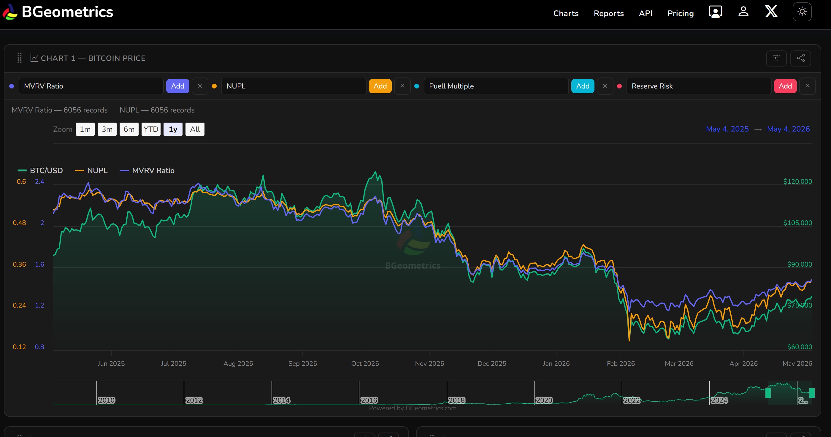
The dashboard presents five interactive Highcharts panels arranged vertically, with the first always visible and the rest collapsable to keep your view uncluttered. On desktop, charts 4 and 5 sit side by side to make the most of your screen.
Each chart is fully independent:
- Select up to 4 metrics per chart, each plotted on its own Y-axis so very different scales (price vs. MVRV, say) remain readable.
- Drag and reorder charts by grabbing the handle — your preferred layout is remembered.
- Rename any chart title to something that makes sense to you.
- Copy a shareable link that encodes the exact metric combination, so you can send a specific view to anyone.
- Export to PNG with a single click, branded and ready to share.
Over 70 Metrics Across Every Layer
The metric selector covers the full stack of Bitcoin analysis:
| Category | Examples |
|---|---|
| On-chain cycle | MVRV Ratio, NUPL, SOPR, AVIV, NRPL, Reserve Risk |
| Miner economics | Puell Multiple, Thermocap, Thermo Price, Miner Revenue |
| Realised value | Realised Cap, Delta Cap, Investor Price |
| Coin days | CDD, MVOCDD |
| Address distribution | Balances: >1 BTC, 10–1 BTC, 100–10 BTC |
| Technical indicators | SMA/EMA 7/50/200, MACD |
| Market sentiment | Fear & Greed Index, Funding Rate, Open Interest |
| Macro | M2 Global, M2 YoY Change, ETF Flow |
| Crypto comparison | ETH, SOL, XRP, DOGE and 15+ other coin prices |
Whether you are monitoring a cycle top signal like NUPL approaching euphoria or overlaying M2 supply against Bitcoin price, you can do it without leaving the dashboard.
Persistent Configuration
Your dashboard is saved to your account. Metric selections, chart order, and custom titles are all restored the next time you log in — there is nothing to reconfigure after a browser refresh or a visit from another device.
Shareable Chart Links
Each chart has a copy link button that encodes the current metric selection into the URL. Paste it into a message, a report, or a Slack thread and the recipient sees exactly what you built — no screenshots required.
Rate Limits and Tiers
Each metric selection triggers a live API call. The dashboard shows a clear warning when your request quota is running low, with a direct link to upgrade. Available tiers range from STANDARD (8 req/h) through ADVANCE (200 req/h) up to PROFESSIONAL (1000 req/h), so heavy research workflows are fully supported.
Getting Started
Access the dashboard at portal.bgeometrics.com/dashboard.html. A free account is enough to start exploring — log in, pick your first metric, and build from there.
For a full list of available metrics and their API endpoints, see the API documentation.